Bright Space, Dynamic Woman, Interesting Work

Enjoyed a fleeting visit (let's do coffee NEXT time, Sally!) to printmaker Sally Hirst's studio this week:
http://www.sallyhirst.co.uk/
She's just done really well at this year's Norwich Print Fair


Sally showed me her new discovery - a versatile paper from the US that she's been printing on to.
It is thin yet robust and has a slight transparency, allowing her to layer up collage; creating interesting surfaces of abstract compositions:


Sally explained that her work always begins with a representational start point - usually industrial architecture.
She screen-prints, stencils and adds rust to paper initially, to begin to break up the surface.


Working onto small square blocks, with raised elements, Sally constructs a collage's abstracted theme, building a low-relief surface:


I think all that layering sustains visual interest - it's subtlety demands a closer look. the above photo shows two finished pieces sitting with the grey base blocks.
It's always inspiring to meet a new fellow practitioner and have a peek around their work-space


We're planning an exhibition - probably in 2016 - with at least one other abstract artist, maybe a painter or two...so look out...
See more of Sally's mixed media panels at her website: HERE 
Thank you Sally!

Love The Way Pinterest Introduces Me To New Inspiration

I never cease to be amazed by how durable and contemporary a lot of abstract paintings from the early and mid 20th century remain.
It is almost quite a shock to see a photograph of the young Auguste Herbin and link him with these images, although he wasn't painting these geometric abstracts in 1911, when that photo at the bottom was taken.
These works were painted in the 1940s, 50s and 60s.
I've just found Herbin tonight on Pinterest - don't think I've ever seen his work before.
Herbin was French. He moved to the same complex of studios as Braque and Picasso in Paris - and became a cubist painter, before venturing into abstraction.

Auguste Herbin (French, 1882-1960), Non 3, 1952. Oil on canvas, 92.2 x 73 cm.

Jour (Day). 1953 The style of art created by French painter Auguste Herbin (1882-1960) ranged greatly throughout his career; evolving from Impressionism to Cubism and lastly geometric abstraction. In 1909 he moved into the famous Bateau-Lavoir Studios in Paris, where he shared walls with Picasso and Braques. Sadly, in 1953 Auguste was inflicted with one of the worst ailments that an artist could suffer, lateral paralysis, forcing him to re-learn to paint with his left hand.

Colorful Shapes Make Me Really Happy - Auguste Herbin

stilllifequickheart: 1951. Auguste Herbin, a French Cubist and later abstract painter whose work forms a bridge between the Cubist movement and post-war geometrical abstract painting.

Violon par Auguste Herbin

Auguste Herbin, A No 2, 1955. Oil on canvas. Size in Cm: 89 x 116.

Apparently he got a thing called lateral paralysis - and I quote from someone on Pinterest "was inflicted with one of the worst ailments that an artist could suffer...forcing him to re-learn to paint with his left hand". That's what I've been doing wrong - I have been 'suffering' from using my left hand..
I'm going to use these strong images as analogy when teaching Layout / InDesign with my Graphic Design students next week and see if they can guess their date - quiz time
Might as well be blocks of images and text as colour and paint, eh? - A great lesson in composition / design

Pinstripe suit and hat | The painter Auguste Herbin in Picasso’s atelier (11 Bld. de Clichy), ca 1911 - by Pablo Picasso

More Abstracts - Angles and Tangles of Bits and Bobs

I love to make digital collage - which, if you've visited my website at anniebrundrit.co.uk - you'll know that I use as if it were a form of sketchbook. 


I can work/play really quickly, allowing me to explore ideas quite rapidly, with an immediacy.


Also, if I choose to, I have the indulgence of employing the same elements over and over again - in different digital collages - or even within the same digital piece. 
This is a great contrast to my paper collages, where each one is original. 
Naturally, in my one-off art pieces, I can use each element I find (or make) only once.


There's also something quite liberating about the fact that they only exit digitally, created on a website and floating around on the internet.


For my up-coming exhibition, I am, however going to get some postcards and greetings cards printed - so look out for details of the exhibition when I publish the flyer - soon...

Have You Seen Matthew Collings' Programme on BBC4 - 'The Rules Of Abstraction'...?

There's definitely a resurgence of the British affinity with abstraction at the moment - maybe triggered by the wonderful 'Suprematism' abstracts of Kazimir Malevich's amazing retrospective at Tate Modern.
I'm so very glad I got to see this exhibition.


The first few rooms introduce a young Malevich, who is teaching himself the art of painting - through rich experimentation of the various styles around him at the time. He explored Symbolism, with tiny precious images that are magical as Indian Miniatures, then dabbled in a gorgeous chalky Pointillism. 


In this self-portrait he seems influenced by Gauguin - with a flourish of Fauvism and possibly Matisse in the background.
But it was the next three rooms that slowed me right down - I got my close-up specs out - and looked and looked and looked.


Groundbreaking. breathtaking. Malevich is a consummate master of composition.
Bold and Striking:


Detailed and Playful:


Skillful with Colour:


Serious and Thoughtful:


And - able to combine all the above qualities too:


Next, there was a big room with gazillions of tiny drawings - the walls painted a light-absorbing dull turquoise (my favourite colour), which set off the wooden frames and their deep off-white mounts; allowing the small sheets of often squared, yellowing paper to sing out with his careful deliberate drawings - plans and dreams.
But those plans and dreams for an abstract future we not to be - as the Russia he inhabited was now a Stalinist Russia - where the purpose of art was as propaganda; to educate. 
Art was expected to show one clear and unambiguous meaning...mmm...ruled out abstraction then.
So, Malevich focused on being an educator and a writer. 
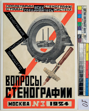
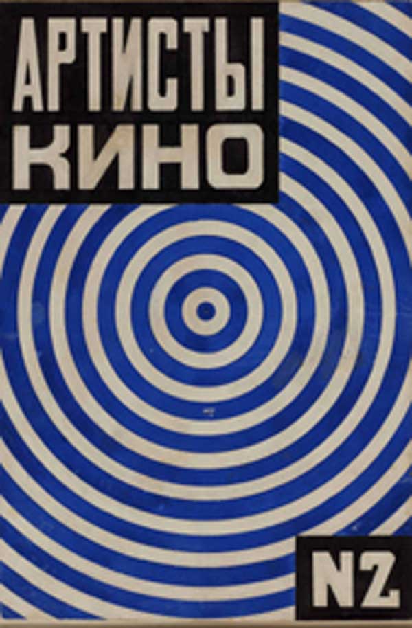
With enlightened curating, there was a room of large teaching resources; posters made by Malevich setting out theories of art movements - and clearly advocating Suprematism early on. 
There was some great work by some of his students. 
I think Lyubov Popova was really very talented. She worked as a teacher, as well as being a painter and designer. I didn't know about her before visiting the exhibition - considering she died aged just thirty-five, she was very prolific.


It seems Malevich was pretty good at teaching. 
If he taught with as much charisma as he painted, I can imagine he was an inspiration.
Shame though - all that power, energy and command of the non-representational surface was lost; abandoned...
Well - not quite - as he couldn't help but bring some of that amazing force into later work: 


In he last room hang a number of portraits with almost Hans Holbein-ian flesh tints and backgrounds, seemingly all the colours darkened with black (unlike his Gauguin/Fauvist self-portrait), but for audacious flat solid abstract rectangles and triangles slapped defiantly on top (Suprematism sneaking in?).


It's on until 26 October - GO - GO - GO
And - be sure to watch iplayer - BBC4's gone all Abstract too...

The Romanov Wall...?

Now that the Creative Arts department has moved to a new building - the demolition of the old Art Corridor is well underway.
Fascinating views remain of the shored-up chimney, the doors into the outside - that used to be the studios - and the traces of what was once there - the roof, walls, floors and where cabling and boxes used to be.
I had to take some photos of these abstract structural compositions; punctured by brightly-coloured doors and framed by the fencing around the site. 
They have given me lots of ideas for collages:


Look - at this image - the RSJ erupting from the top left - and the glorious rectangular vestige of something that was attached to the wall before it was painted white... Then what are the black smudges, spattered about the middle and top right? There's a sort of potential for violence about them. An intriguing prospect - making me want to call it The Romanov Wall:

Speaking With Their Eyes

A dear friend introduced me to the work of Vivian Maier at the weekend.
I had a visit to the website and she was a fascinating woman - a nanny and a loner - who took her camera out with her. 
Thanks to Maier, there's a vivid record of the strangeness of everyday life from the US (during the fifites, sixties and seventies) but also further afield; as she was a great traveller.
I grabbed a few photos of children as I loved the poignancy in their little eyes - innocence and so much knowing...

VM19XXW04208-03-MC

VM1955W00565-06-MC

VM1959W02645-07-MC

VM19XXW03463-02-MC

VM19XXW03454-06-MC

VM19XXW03250-12-MC

Here's a couple of my boys too...