Naturally, as I had the camera in my hands - my eyes began to see the potential photo in everything, so here are a few more nice colour combinations - or just things I think are pretty, lying around the kitchen and dining room
Cool Colour Combination?
I have these lovely little plastic ice-cream bowls that were a gift (with a bottle of delicious ice-cream sauce too). They are very pretty, a set of four; each a different colour with four coloured spoons to match. I had just stacked three of them ready to put up on the dresser when I realised the colour combination is a dream - I love it
Valentines Inspirations?
I've been looking for some inspiration for drawings that will - hopefully - lead to some ideas for designs and images.
I find that I either look outward; to museums or architecture or landscape maybe... or inward (sort of) to my own family history.
We're the sort of family that doesn't get rid of stuff - so I have my Granny's sewing box and my great great grandmother's sampler - that she stitched when she was eight years old.
And I have a little box of Victorian and early 20c Valentine and other greetings cards.
And - I was thinking "it's the 14 Feb quite soooooon"
I just laid some of them down on the scanner earlier and these are the images:
I always thought they were really beautiful apparently - but unfortunately, I have been informed - as a little girl - I got hold of them once and assumed they would open up like the greetings cards I was familiar with and kind of pulled most of them apart - eeeeek!
Maybe they'll inspire me to do something sweet and a little old fashioned for the love of my life - how about that!
I find that I either look outward; to museums or architecture or landscape maybe... or inward (sort of) to my own family history.
We're the sort of family that doesn't get rid of stuff - so I have my Granny's sewing box and my great great grandmother's sampler - that she stitched when she was eight years old.
And I have a little box of Victorian and early 20c Valentine and other greetings cards.
And - I was thinking "it's the 14 Feb quite soooooon"
I just laid some of them down on the scanner earlier and these are the images:
Maybe they'll inspire me to do something sweet and a little old fashioned for the love of my life - how about that!
Have You seen the Bad Apple?
I gave a lecture to my first year students yesterday which introduced their 'Narrative' project.
As part of that, I played them a video that I think is a magical piece of stop-motion animation; apparently made from 6,566 still photos of printed bitmaps

Here is the blurb from http://pinktentacle.com/
The creator, "shige-ruuu," says he made the video without using photo-editing software.
The images were captured with a webcam, and the effects were achieved by changing the camera position and adjusting the focus, brightness, zoom, exposure and gain.
The song is "Bad Apple!!" (arranged by Masayoshi Minoshima, vocals by nomico)
The animation is on you tube
As part of that, I played them a video that I think is a magical piece of stop-motion animation; apparently made from 6,566 still photos of printed bitmaps

The creator, "shige-ruuu," says he made the video without using photo-editing software.
The images were captured with a webcam, and the effects were achieved by changing the camera position and adjusting the focus, brightness, zoom, exposure and gain.
The song is "Bad Apple!!" (arranged by Masayoshi Minoshima, vocals by nomico)
The animation is on you tube
And...following on from yesterday...
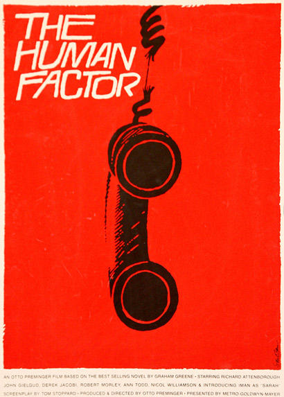
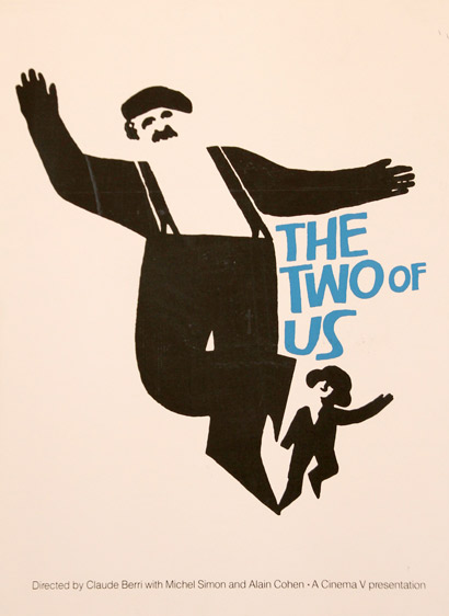
Here are some posters by that amazing typeface guru Saul Bass - By the way do you know what the difference is between a typeface and a font?
Read on...


 ffffound.com
Well - a typeface is the name for the collection of fonts that make up the 'herd' of for example Helvetica

So, all the versions above are fonts within the typeface called Helvetica.
I find I can get a bit geeky-nerd about typography... Have you read 'Just My Type' by Simon Garfield? It is really fascinating and beautifully written, unputdownable, which I never thought I'd say about a book on fonts!!
Read on...


Well - a typeface is the name for the collection of fonts that make up the 'herd' of for example Helvetica

So, all the versions above are fonts within the typeface called Helvetica.
I find I can get a bit geeky-nerd about typography... Have you read 'Just My Type' by Simon Garfield? It is really fascinating and beautifully written, unputdownable, which I never thought I'd say about a book on fonts!!
Thanks Rob!
Rob, a colleague, is often sending useful links and I really liked this blog he recommended recently... It's about artist and graphic designer Julian Montague's interests and diversions.
He is a collector of books too, mainly for the designs on the covers. Each day he puts up a post called 'Daily Book Graphics' - which showcases a book cover from his collection and sometimes the illustrations from within.
Here are a few examples:
I love the text, used as an image - and the colours, who'd have thought the orange / purple / navy combo would work? It's inspiring for new colour combinations in future designs...
So simple yet wholly effective - those torn edges adding a touch of drama - especially as that eye suspisiously looks past it - towards the opening edge and the story inside the book!
Leaving two sides brown and two black is a great design decision, I bet I'd have been tempted to make the whole thing black...
And the images work so well with the titles - well I suppose they should do really - that's why they were chosen to go to print!
Take a look for yourself - which are your favourites?
There's a grand page on the Montague blog where you can see tiles of all the covers so far - called the Flipcard
Take a look here
Thanks to Julian Montague for a lovely useful resource / inspiration / research tool
And thanks Rob for finding it!
He is a collector of books too, mainly for the designs on the covers. Each day he puts up a post called 'Daily Book Graphics' - which showcases a book cover from his collection and sometimes the illustrations from within.
Here are a few examples:
Leaving two sides brown and two black is a great design decision, I bet I'd have been tempted to make the whole thing black...
And the images work so well with the titles - well I suppose they should do really - that's why they were chosen to go to print!
Take a look for yourself - which are your favourites?
There's a grand page on the Montague blog where you can see tiles of all the covers so far - called the Flipcard
Take a look here
Thanks to Julian Montague for a lovely useful resource / inspiration / research tool
And thanks Rob for finding it!
How do you Start with your Designs?
So – how do I get the ideas and drawings for all these animal designs?
Well first of all I always do research - I love to look at lots of the work of designers and illustrators in books and on the web. Two of my fave destinations are Print & Pattern and Pikaland
Then I just start to doodle and draw – in sketchbooks, on the bus, on spare paper... and these are quite rough – and I do draw over them. I tend to draw straight in with pen
As I don’t have a lightbox, I tack paper to the window – works a treat! I trace over – making little changes to develop just the right emphasis or simplicity or style required...Like the elephant above
When the colour and background is applied the design comes to life!
You can see how I changed the badger’s stripes – softened them from black and showed the ears more
I got the ideas for the deer and hares and whippets theme because we have a handsome whippet, Alfie
Initially I went for a ‘tattoo’ type style of drawing but I ended up removing the outlines altogether for the final camouflage designs
Then there were the woodland creatures – I wanted to give them a bit more of a ‘cute’ less sophisticated style, but keep the colours ‘grown-up’.
I do hope you enjoy seeing a little bit of the background to the way I work, do let me know what else you would like to hear and see about how I work and what interests me...
Maybe you’d like to see how I created some of those backgrounds soon?
Well first of all I always do research - I love to look at lots of the work of designers and illustrators in books and on the web. Two of my fave destinations are Print & Pattern and Pikaland
Then I just start to doodle and draw – in sketchbooks, on the bus, on spare paper... and these are quite rough – and I do draw over them. I tend to draw straight in with pen
As I don’t have a lightbox, I tack paper to the window – works a treat! I trace over – making little changes to develop just the right emphasis or simplicity or style required...Like the elephant above
You can see how I changed the badger’s stripes – softened them from black and showed the ears more
I got the ideas for the deer and hares and whippets theme because we have a handsome whippet, Alfie
Initially I went for a ‘tattoo’ type style of drawing but I ended up removing the outlines altogether for the final camouflage designs
Even little things like where I put the eyes make all the difference in terms of expression
Maybe you’d like to see how I created some of those backgrounds soon?
Subscribe to:
Comments (Atom)


